Make Lemonade
You need to prepare a refreshing glass of nimbu paani on a hot afternoon. Task: Create a visual recipe manual showing the ingredients, quantities, mixing sequence, and final drink.
Notes
- • Show the recipe in a clear step-by-step sequence.
- • Use simple visuals, symbols, arrows, and short labels.
- • Show important ingredients, quantities, tools, and actions clearly.
- • Keep the instructions simple enough for a first-time user.
- • Do not write long explanations.
Start timer
Evaluation criteria
- • Clarity: The process should be easy to understand.
- • Sequencing: Steps should follow the correct order.
- • Visual Communication: Actions and quantities should be clearly shown.
- • Usability: A first-time user should be able to follow the manual.
- • Layout: Information should be organised and easy to scan.
- • Drawing: Objects and actions should be clear and recognisable.
Submit your sketch
Upload your work to appear in the gallery after review.
Community Work
Loading sketches…
Community Work
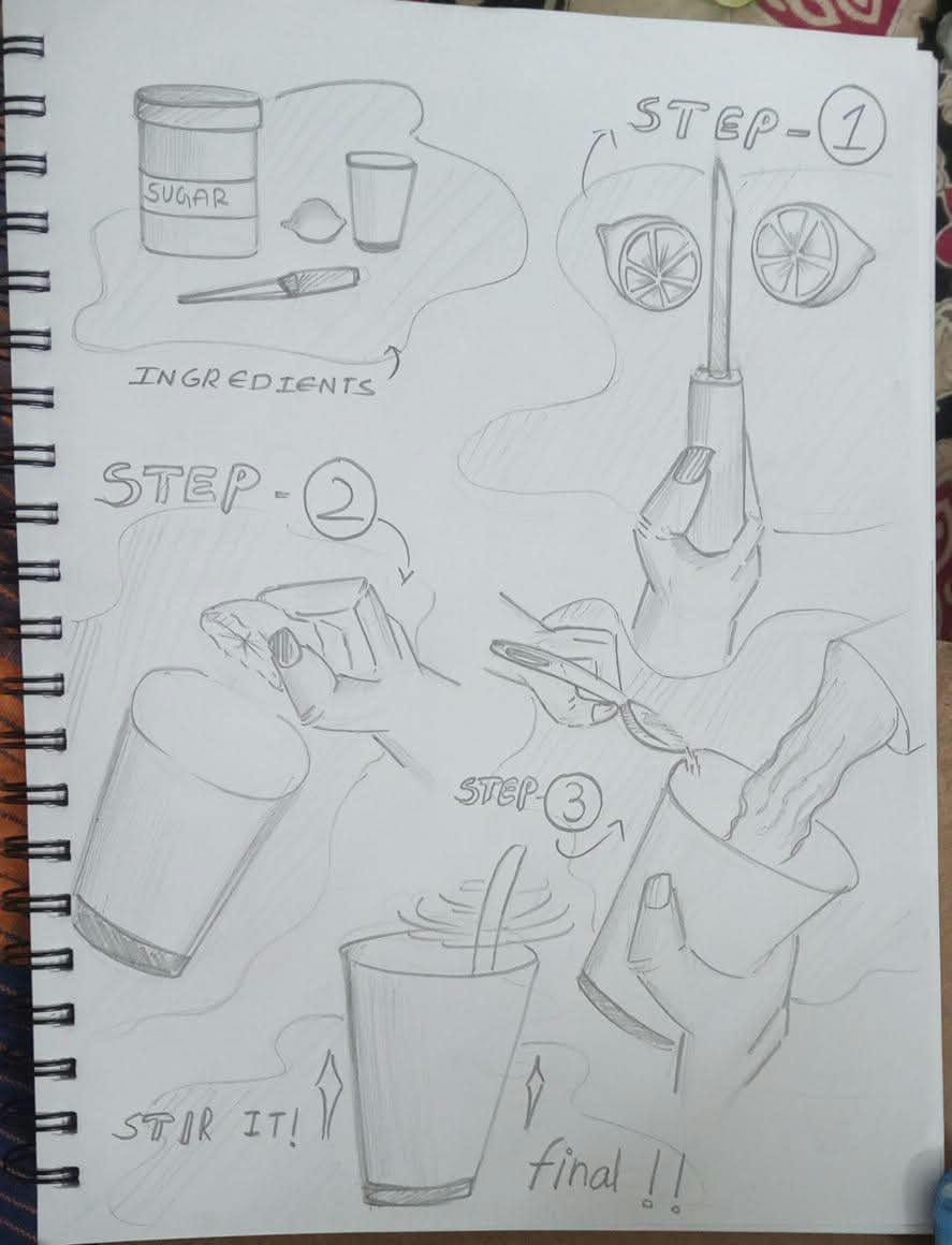
Anonymous
I really like the sketching style here. The illustrations are expressive, and you've made a good attempt at making the lemonade-making process visually interesting. However, the steps are a little confusing at first glance. I understand you've tried to make the presentation creative, but in design, we should always prioritise functionality and clarity over visual appeal. The sequence of actions needs to be more structured, with a clear beginning and end. Some hand movements and object interactions are not immediately understandable. The proportions of the hands, glass and other objects also need refinement to make the illustrations more believable. Make the arrows more directional and consistent, and ensure each step communicates one clear action. Also, improve the visual hierarchy between step numbers, illustrations and instructions. Good illustration skills and creative approach. Now focus on making the manual intuitive enough that someone can follow it without needing an explanation.
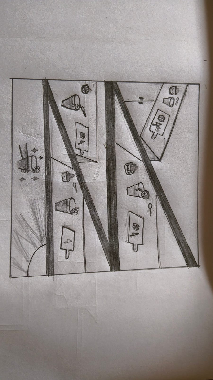
Anushka Das
Your sketching is very tiny and difficult to understand, you have not put more focus on the main object, the steps are looking like sticky figures. The sequence communicates the process well its too tiny sketch, adding clear numbers and labels would make it easier to follow. Give more emphasis to the glasses and the key steps in the process so that the viewer’s attention goes to the most important elements. you need to redraw it. you need to put more focus and improve your presentation, also need to improve line quality and confidence in the sketch. redraw it . and practice more to improve.
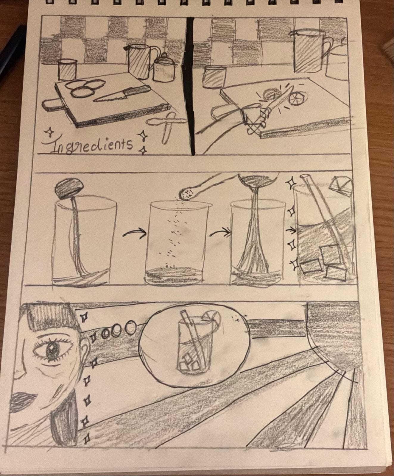
Anonymous
I like the sketching style, as it has a distinctive character and an interesting storytelling approach. The sequence communicates the process reasonably well, but adding clear numbers and labels would make it easier to follow. Give more emphasis to the glasses and the key steps in the process so that the viewer’s attention goes to the most important elements. The composition is well organised, but the heavy shading sometimes competes with the main visuals. Work on developing more mature, confident strokes and improving the proportions and detailing. With better visual hierarchy, clearer annotations, and cleaner sketching, the overall presentation can become much stronger.
2.5 (2 ratings)