The Tiny Hostel Room
A student has transformed a tiny hostel room into a personal space. There is a bed, study table, backpack, clothes, posters, headphones, shoes, books, and random objects occupying almost every available surface. Task: Draw the room from the viewpoint of a person standing at the doorway, looking diagonally into the room. Challenge: Demonstrate accurate one/two-point perspective, furniture proportions, depth, and spatial relationships. Aesthetic direction: Personal, expressive, slightly chaotic student room, functional but full of personality.
Notes
- Use only a pencil. Do not use colours.
- Explain your design through visuals and short labels.
- Do not write separate explanations.
- Focus on perspective, proportion, scale, depth, and spatial relationships.
Start timer
Evaluation criteria
- • Perspective Accuracy: Correct horizon and convergence
- • Proportion & Scale: Correct size relationships
- • Depth & Space: Clear foreground, middle ground and background
- • Foreshortening: Accurate representation of angled forms
- • Composition: Effective placement of elements
- • Observation: Relevant environmental details
- • Visual Communication: Clear storytelling through visuals
- • Line Quality: Clean, confident and controlled lines
Submit your sketch
Upload your work to appear in the gallery after review.
Community Work
Loading sketches…
Community Work
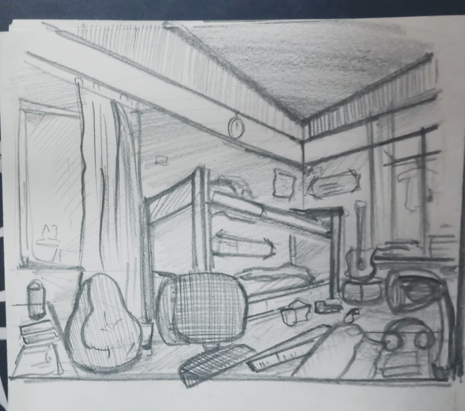
kaniha cr
Good attempt at capturing a detailed interior composition. I personally like messy sketches, but even messy strokes should have a certain maturity, confidence and flow rather than looking hesitant or repeatedly corrected. Your product sketching skills are good, so try bringing that same control into these environment sketches as well. Work on cleaner object construction, consistent proportions and better perspective alignment, especially for the furniture and guitar. Avoid making every object equally detailed; establish a clear visual hierarchy. Use at least two different pencils (HB and 4B) to create depth, keeping construction lines lighter and shadows darker. Also work on light-source consistency and tonal variations. Overall, good exploration, but focus more on mature strokes, spatial understanding and depth rather than adding more details.
3.8 (1 ratings)
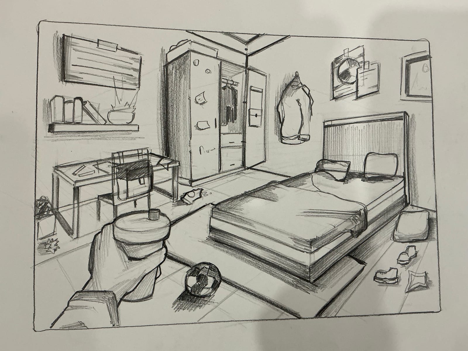
Divyaansi
Enjoyed the sketching style. There's a good stroke hierarchy and good that you've us d bold to highlight main areas. I liked a minimal shade you've given. Perspective is nearly perfect. Just little more effort to be put on. Avoid making everything to boxy. Overall a good attempt
4.0 (1 ratings)
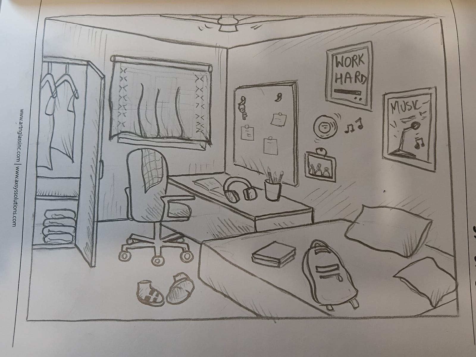
Toya Goyal
I like how you've explored the room as a complete space and included a good variety of elements, such as the wardrobe, study table, bed, wall frames and other personal belongings. The composition communicates the idea of a personal study-bedroom quite well. The detailing on the smaller objects adds character to the sketch. However, the overall drawing could benefit from better stroke consistency and a little more attention to proportions, especially around the furniture. The walls and floor could use more tonal variation to create a stronger sense of depth and space. The bed and study area could also be detailed a little more to make them stand out. Try introducing a clear light source and using shadows to bring the room to life. Overall, a good attempt, but a little more refinement in perspective, proportions and shading will make the sketch much stronger.
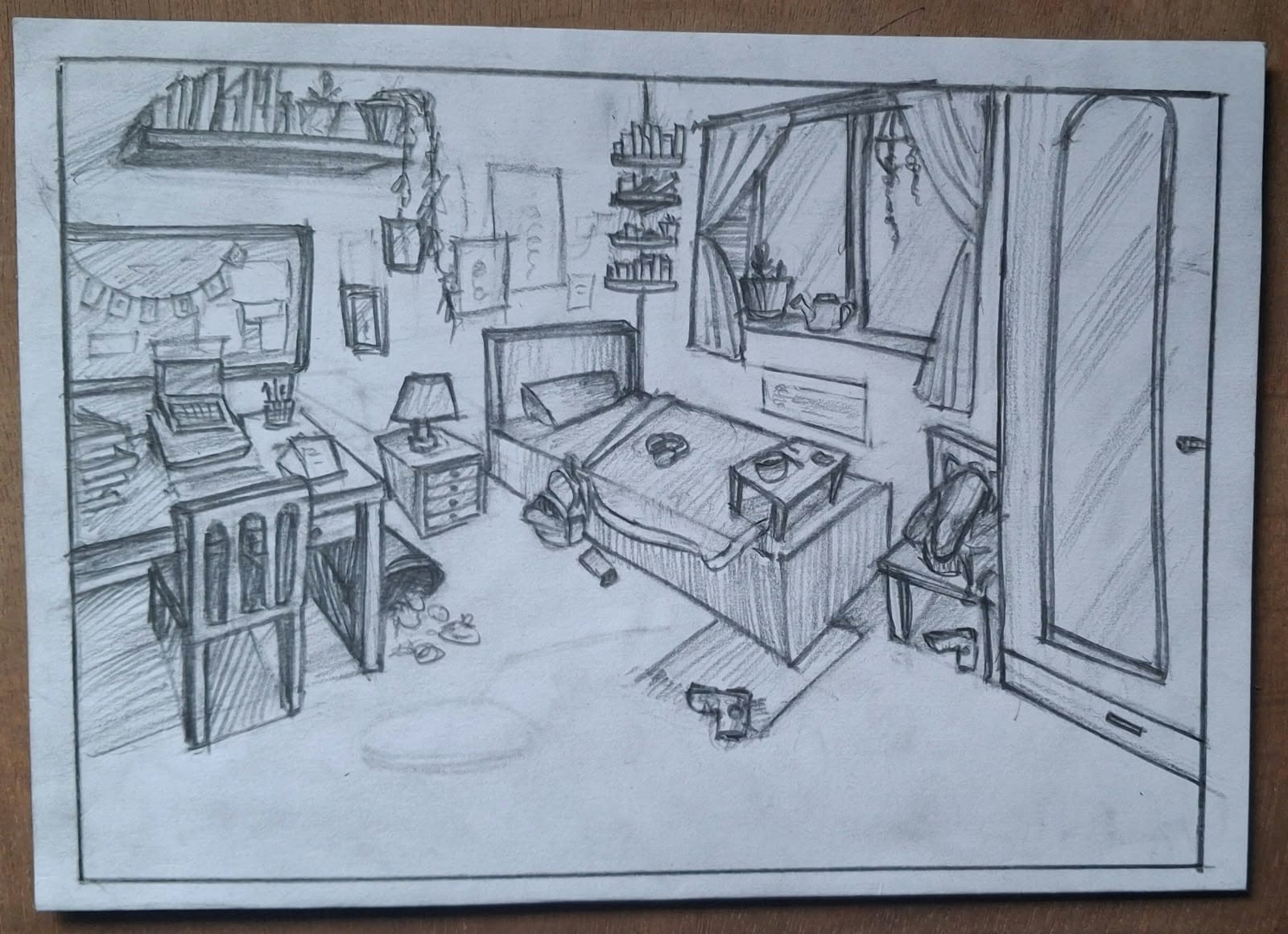
Arya Prajapati
The sketch has a good amount of detailing, and I like how you've tried to create a complete bedroom environment with multiple elements like the study table, bed, shelves, window and wardrobe. The perspective needs more attention, particularly in the furniture, as some edges and proportions don't align consistently. The line quality is quite rough in certain areas, and the shading feels uneven rather than following a clear light source. There is also a lot of unused floor space in the foreground, which could have been utilised better to balance the composition. Try to establish a stronger focal point, refine the furniture proportions and use shadows more intentionally to create depth. Overall, the effort and detailing are appreciable, but the sketch needs better perspective control, cleaner strokes and a more balanced layout to feel complete.
Shrushty Ingle
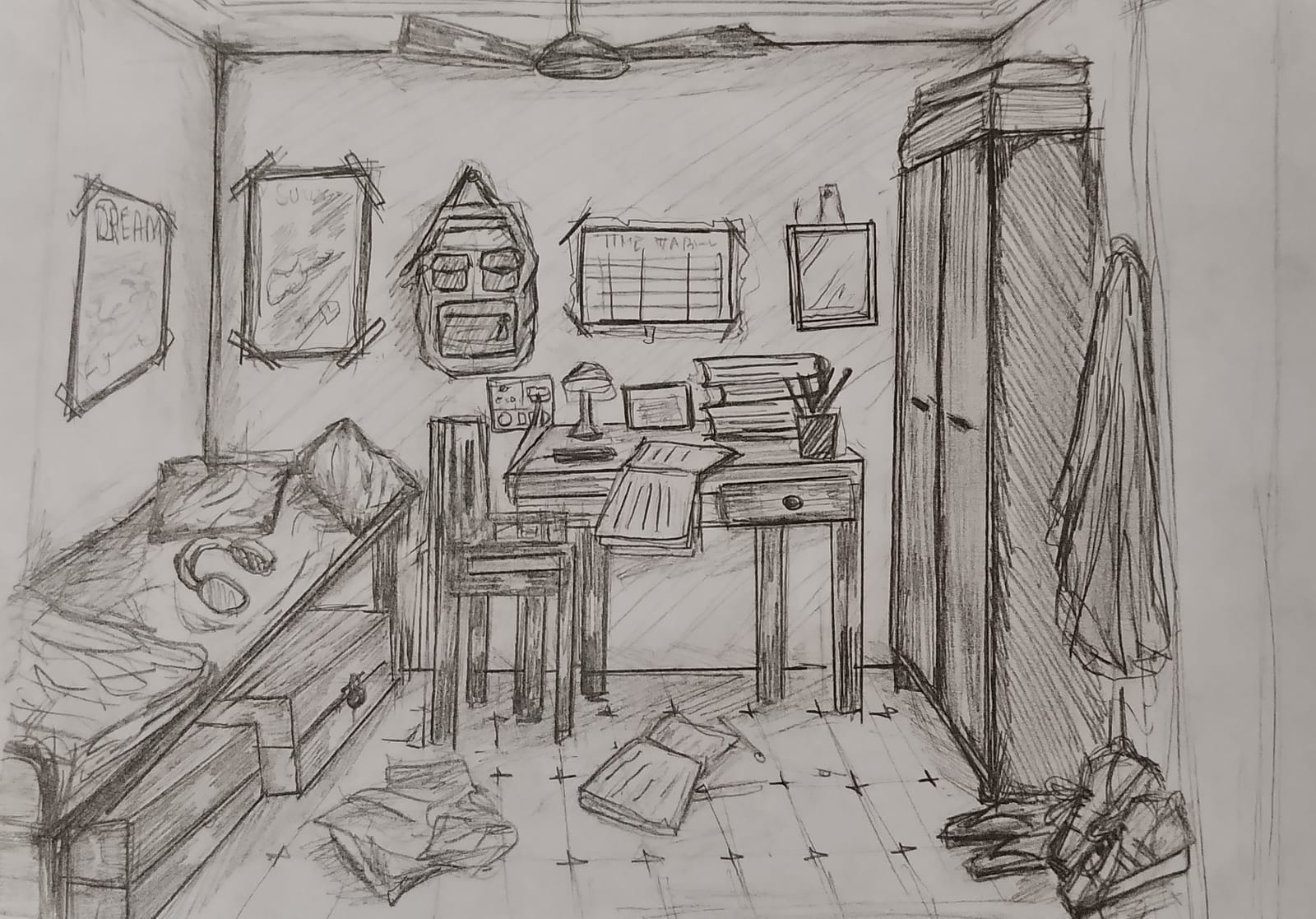
Beautiful😍. Looks like a post modernism artwork. If I look at it from the pov of art work. I enjoyed everything. But from design point of view, we can improve layout and composition. I can see a little distortion in table chair bed etc. There's a lot of drama in your sketch which is a good thing. I'm giving you marks considering its an art work. But always remember: Design is all about making things clear and understandable.
3.2 (1 ratings)
Anonymous
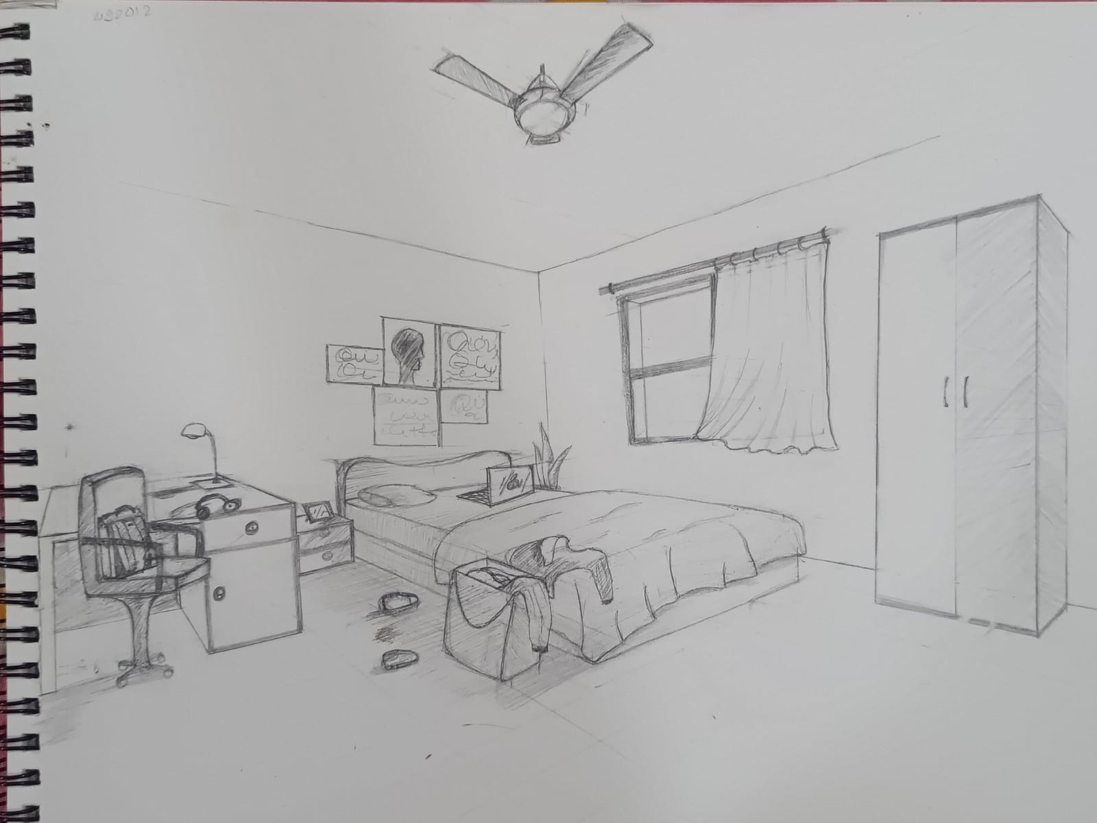
I don't know but I kind of am loving this sketch. Little empty white space. But somewhere the sketch lies in better side. Add some sunrays and some drama to it to make it look full. Posters and all. Correct proportions of bench chair.zoom in a little. No n ed to show this bery hing fully. Cut some part partially. That's fine. But make the sketch fuller.
3.2 (1 ratings)
Parul
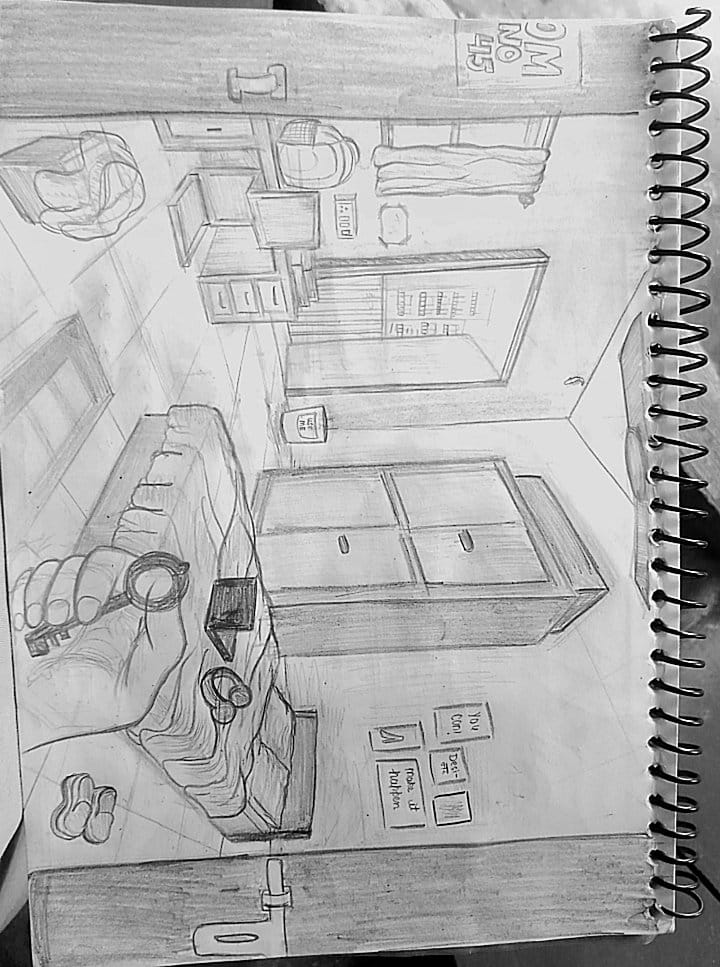
Overall, this is a wholesome sketch. I really like how you’ve filled up the space, and the shading is good too. The only thing is, the floor area looks a little mechanical. Try keeping the tiles lighter and more subtle. The straight lines are too prominent, making it look like you’ve used a scale. The proportions are slightly off, so try to make the objects and human figures look more natural. Before adding details, compare the height, width and size of different parts. Use basic shapes and light guidelines to get the structure right first. The shading is good, but it needs a little more refinement. Don’t shade everything equally. Focus only on areas where shadows help define the form, show depth or separate objects. Identify the light source and keep the shadows consistent. Also, work on the cleanliness of the sketch. Keep your construction lines light, avoid repeatedly going over the same lines, and make the final lines more confident. One more thing, don’t try to make everything hyper-realistic. Focus on getting the proportions, perspective and important shadows right. Save time on unnecessary shading and use that time to correct the structure and refine the sketch. Overall, it’s a fair attempt with good space utilisation and shading. Just work on making the proportions more natural, the lines cleaner and the shading more controlled. Good work!
Parul
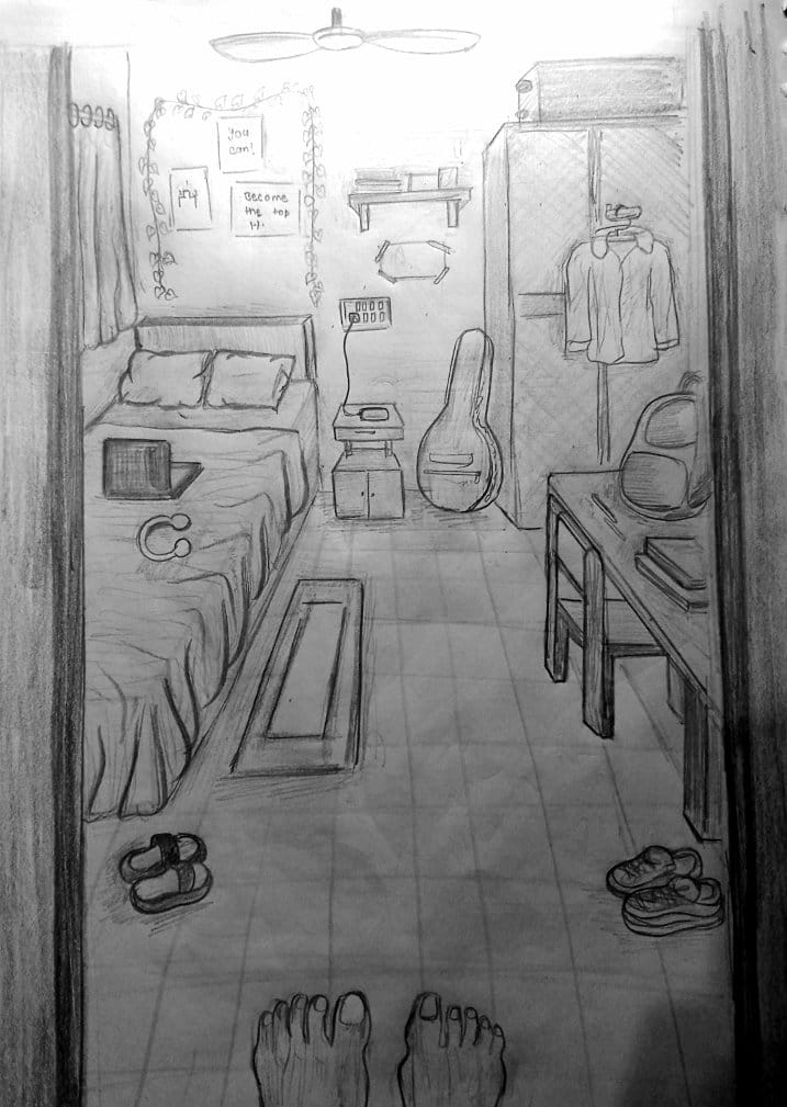
Honestly, this is a good attempt. The room layout works and choosing this kind of one point perspective is not easy. The small details gives life to sketch.. Where it needs work is perspective and form. Some furniture edges don’t follow the same vanishing point, and things like the guitar, table and bed feel a bit flat. Try building them with basic forms first, then add details. Also, there are quite a few loose strokes in the curtains and bedsheet. Keep those cleaner and more intentional. Feets looks like they are in the air. its all because of perspective. The line weight and shading can also be pushed. Keep things closer to us darker and the background lighter to create depth. The feet are a nice touch, but anatomy needs more practice. Overall, good composition and observation. Now just clean up the construction and linework. Suggestion: Try to change the view angle to some easier one. and redo the sketch. Lets see.
3.8 (1 ratings)