A Rainy Evening at a Cafe
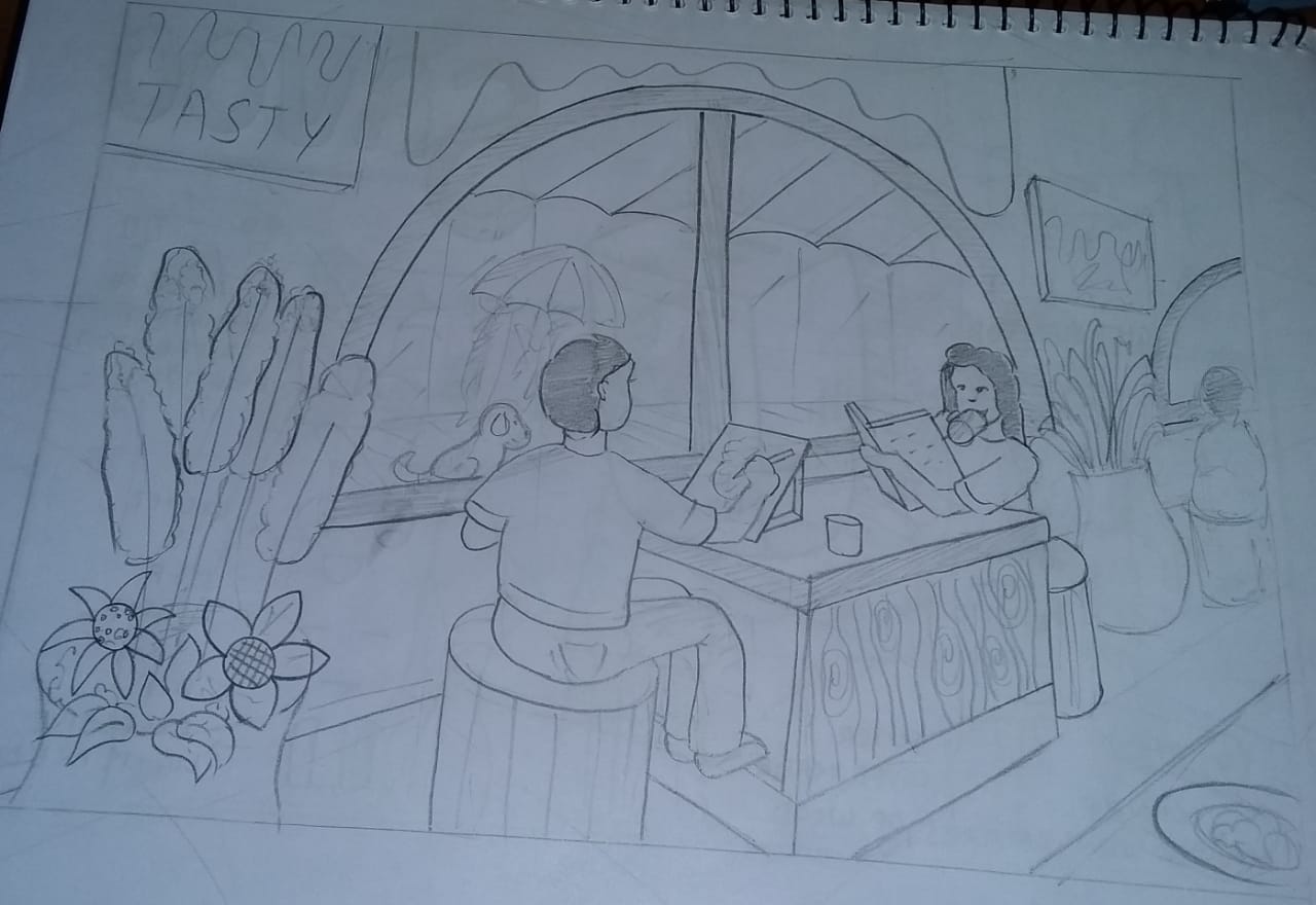
On a rainy evening, two friends are sitting by the large glass window of a cozy café. One friend is sipping coffee while reading a book, while the other is sketching in a notebook. Outside, the street is wet, with reflections of streetlights shimmering on the ground. A couple holding an umbrella is walking by, and a stray dog is sitting under a shop awning, avoiding the rain. The atmosphere inside the café is warm, with the glow of hanging lights, plants near the window, and the quiet hum of conversation. You are sitting at a table across from them, observing this scene. Draw this scenario from your point of view inside the café.
Notes
- Use only pencil
- Do not use colours
Start timer
Evaluation criteria
- Perspective
- Proportion
- Composition
- Observation
- Imagination
- Quality of sketch
- Attention to detail
Submit your sketch
Upload your work to appear in the gallery after review.
Community Work
Loading sketches…
Community Work
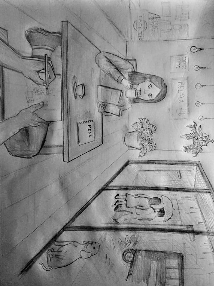
Parul
hey Parul. The line quality and perspective are fine, the detailing on the table needs some work. However, you need to improve on the line confidence, the detailing of the wall is missing which makes background elements look rough. also to make your sketch organic and actionable, you need to add more action human figures. currently I can see you have only main human figure, but need to supporting figures. if you see the flowerpot, it looks rough and not in symmetry.
4.8 (1 ratings)
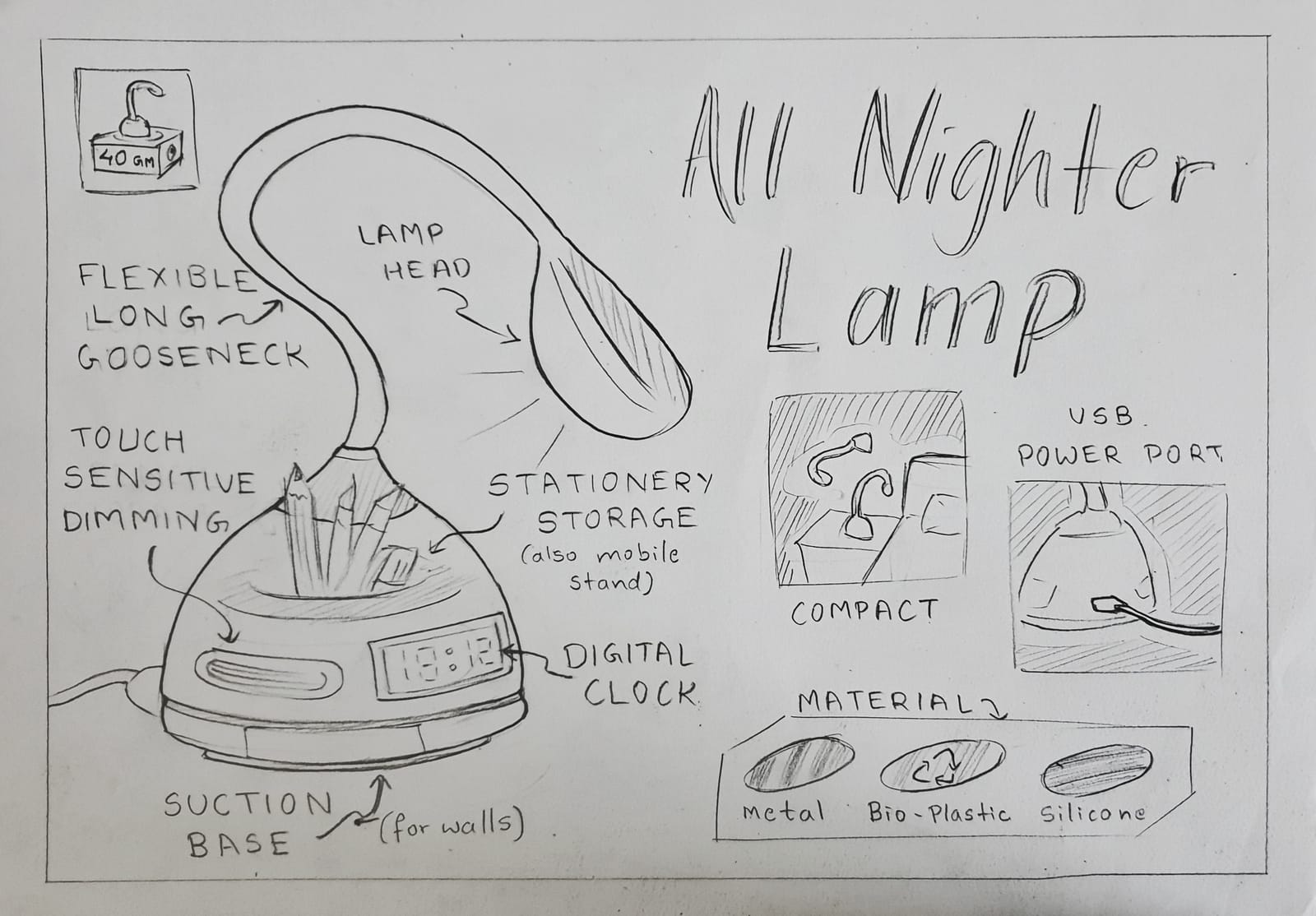
Anonymous
2.9 (4 ratings)
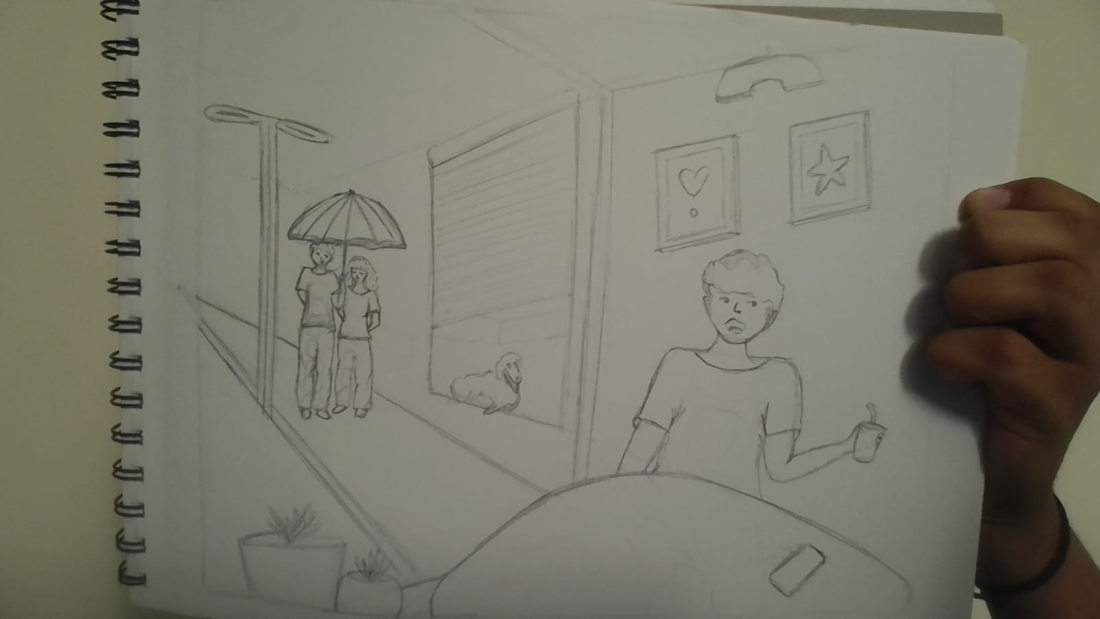
Rishika Sharma
Hey Rishika! I see a significant distortion in placement, anatomy, projections & proportions, view angle almost everything. Quality of strokes and lines is below par and needs a lot of work. The sketch is not at all compliant to the level of UCEED. See we don't have time so I'll suggest you things to do everyday. 1. Practise fundamental lines, circles practise - 1 Hour Early Morning 2. atleast 10 rapid Live sketching (dont worry about mistakes, just try to draw things as you see) 3. Atleast 10 product sketches (whatever products are visible to your eyes) Initially Don't shade. 4. Practise below scenarios Daily: a. Living Room, Kitchen, Garden, Road, Market b. Child, young, Adult, Old age (Both male and female: choose cloths type and keep them same) c. Animals like dog and cat, bird. Car, Bike This needs to be done Daily without fail. Take almost 3-4 Hours for this. Start waking up at 4:00 in the morning to consume most of it. / All the best!!
4.4 (4 ratings)
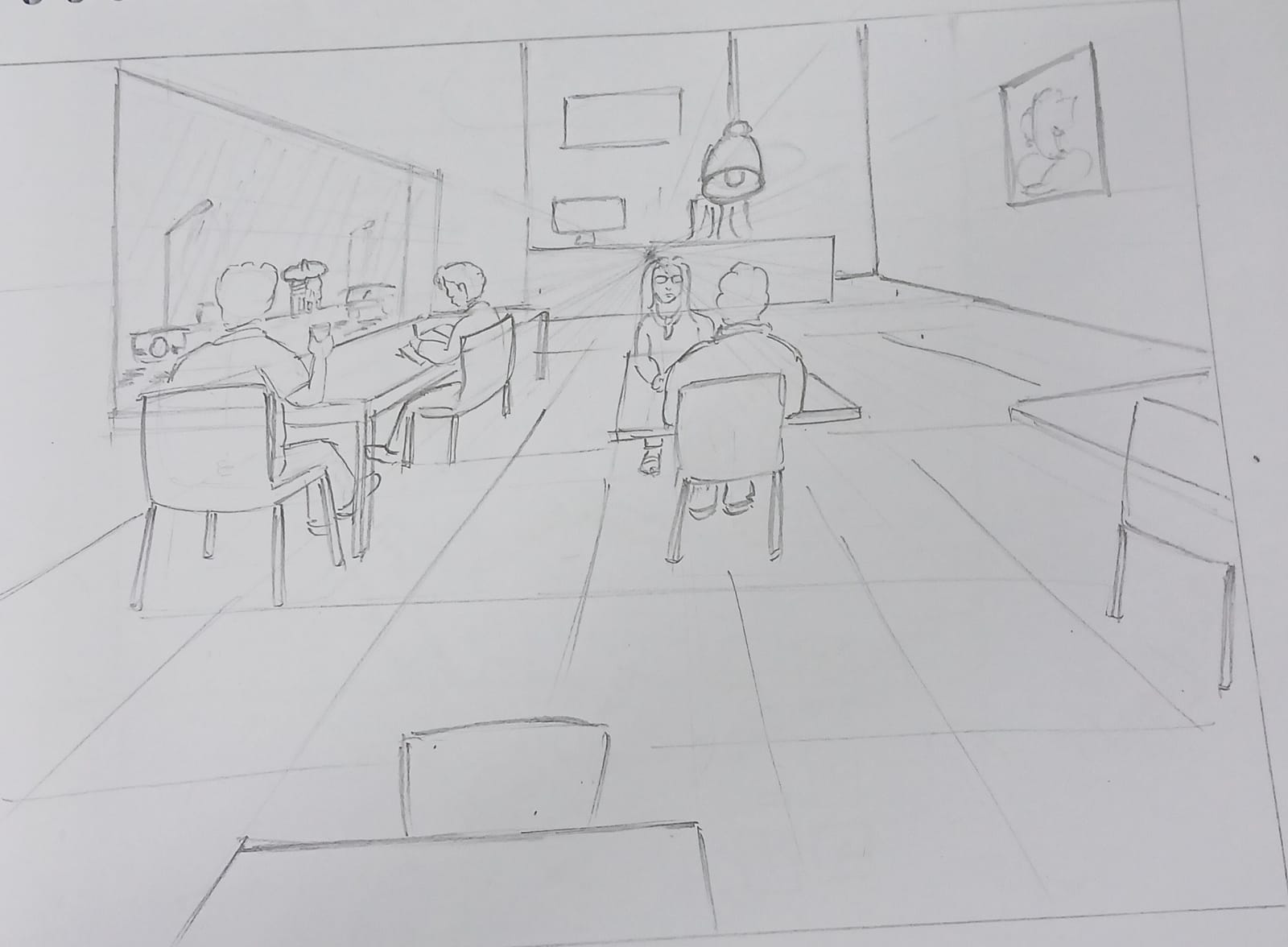
Radhesh Patil
You need to improve on the line quality of the overall sketch. the sketch look rough and need to add details. perspective looks fine but it doesn't signify the scene is from hotels/cafe. try adding more cafe type elements, like waiters, more human figures. etc
5.0 (1 ratings)
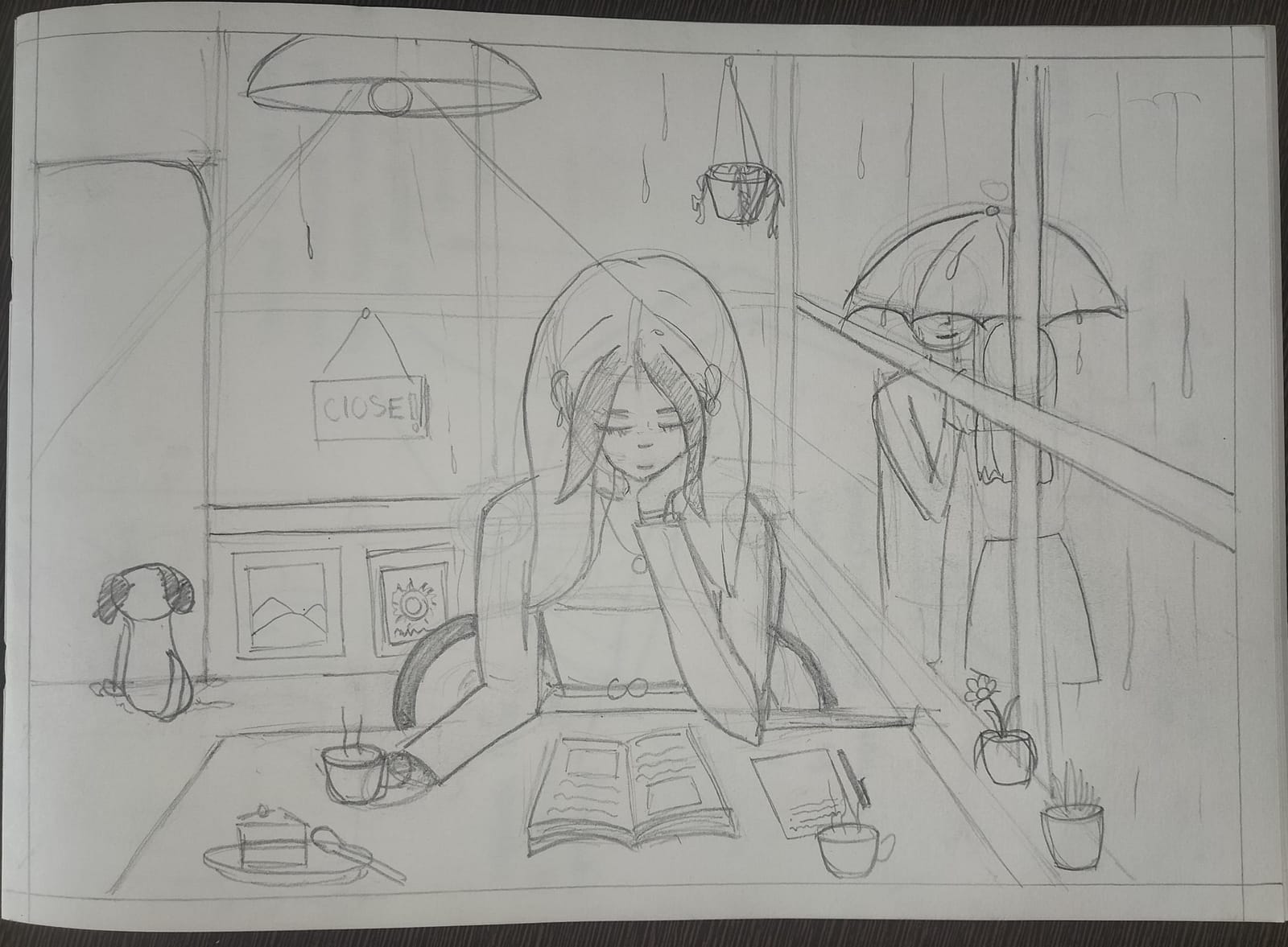
Sharvi Sharma
The line quality and perspective are fine, I can see the emotions and face expressions, the detailing on the table looks fine. However, you need to improve on the line quality, the detailing of the wall is missing which makes background elements look rough. The Question asks to draw two friends whereas in your sketch this is completely missing which makes the sketch incomplete. still adding 8 for your sketch.
4.1 (2 ratings)
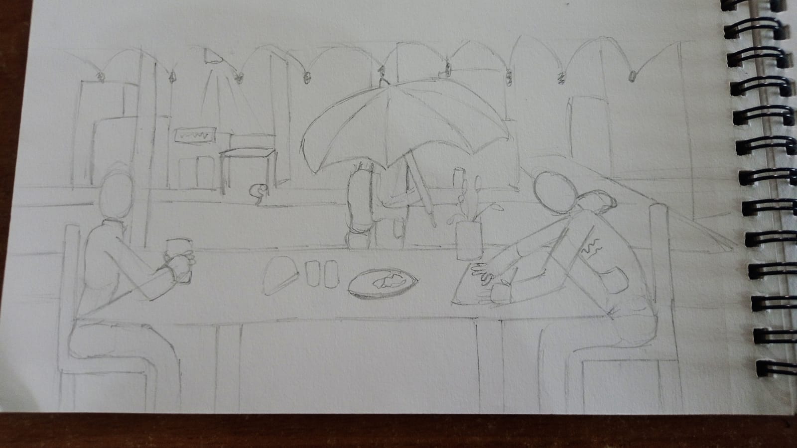
Jason- borthwick
Your sketch looks very rough.it is due to time constraints? I think you can improve in composition, I can see your drawing is linear, need to add detailing, shadow can add depth. also adding different perspective view can create drama in your sketch. overall, you can redraw it with proper focus .
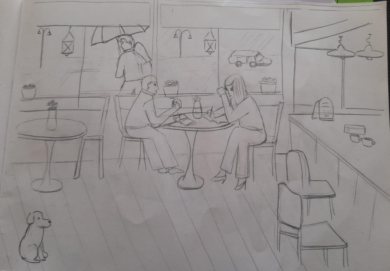
Gauri Boraste
the sketch looks very rough and incomplete. you need to draw elements very carefully. the hierarchy of shadow, line weights are missing. also need to give more focus on perspective and drawing elements in proportions. the outer human figure looks bigger in proportions than the human figure which are seating inside the cafe. overall composition is fine but need to improve on line quality, using perspectives & proportions, shadow and shading.
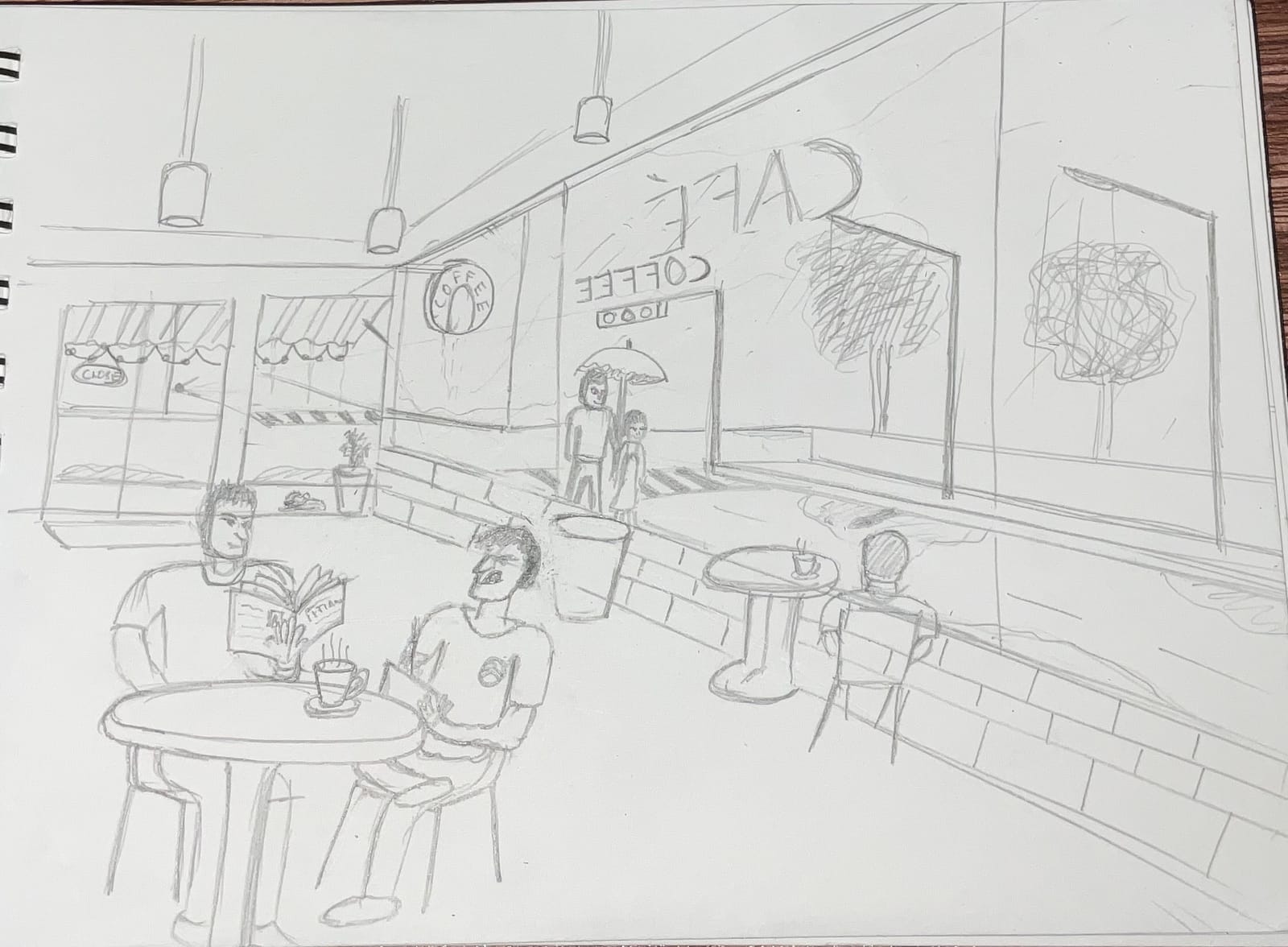
Samartha Kashyap
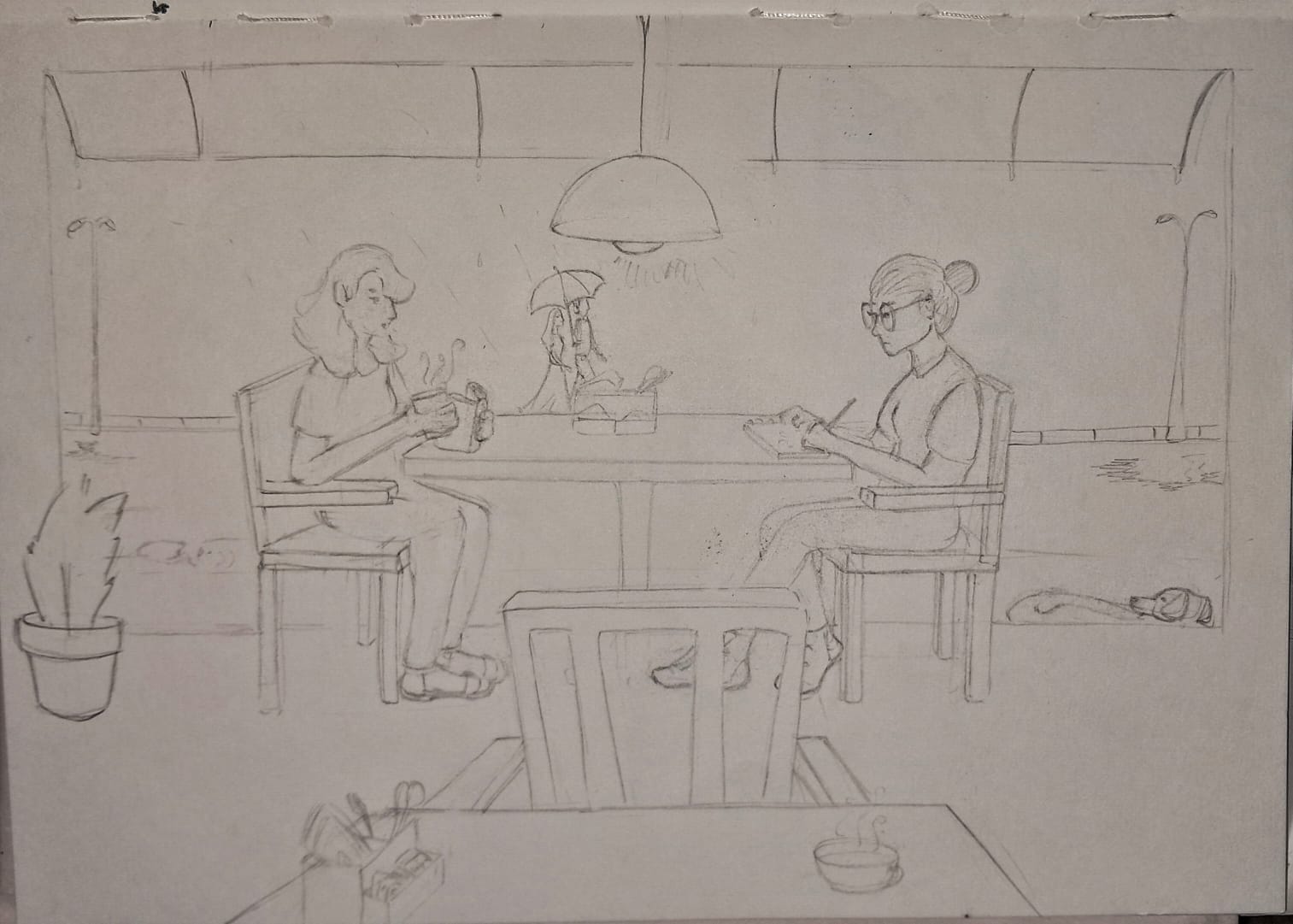
Mahee Sameer
Your perspective look linear, you can add more drama by drawing the whole scenario with different angle and perspective, you need to work on your line quality, the environment dosent look of the cafe you need to add more details to drawing
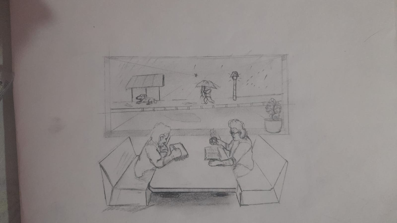
Prateek Bhojak
You used one point perspective here. which is perfect. but composition wise you need to add more elements to your composition. for ex: at first impression it doesn't seems like cafe. you could have added lightings, counters, waiters or more human to your drawing. it would have created notion of cafe. also, your windows look like painting hanging on the wall. you need to clear out edges of your window. the wall and ground - floor intersection is missing. you need to improve on the line quality, hatching/shadows, composition, and overall presentation of your answer sheet.
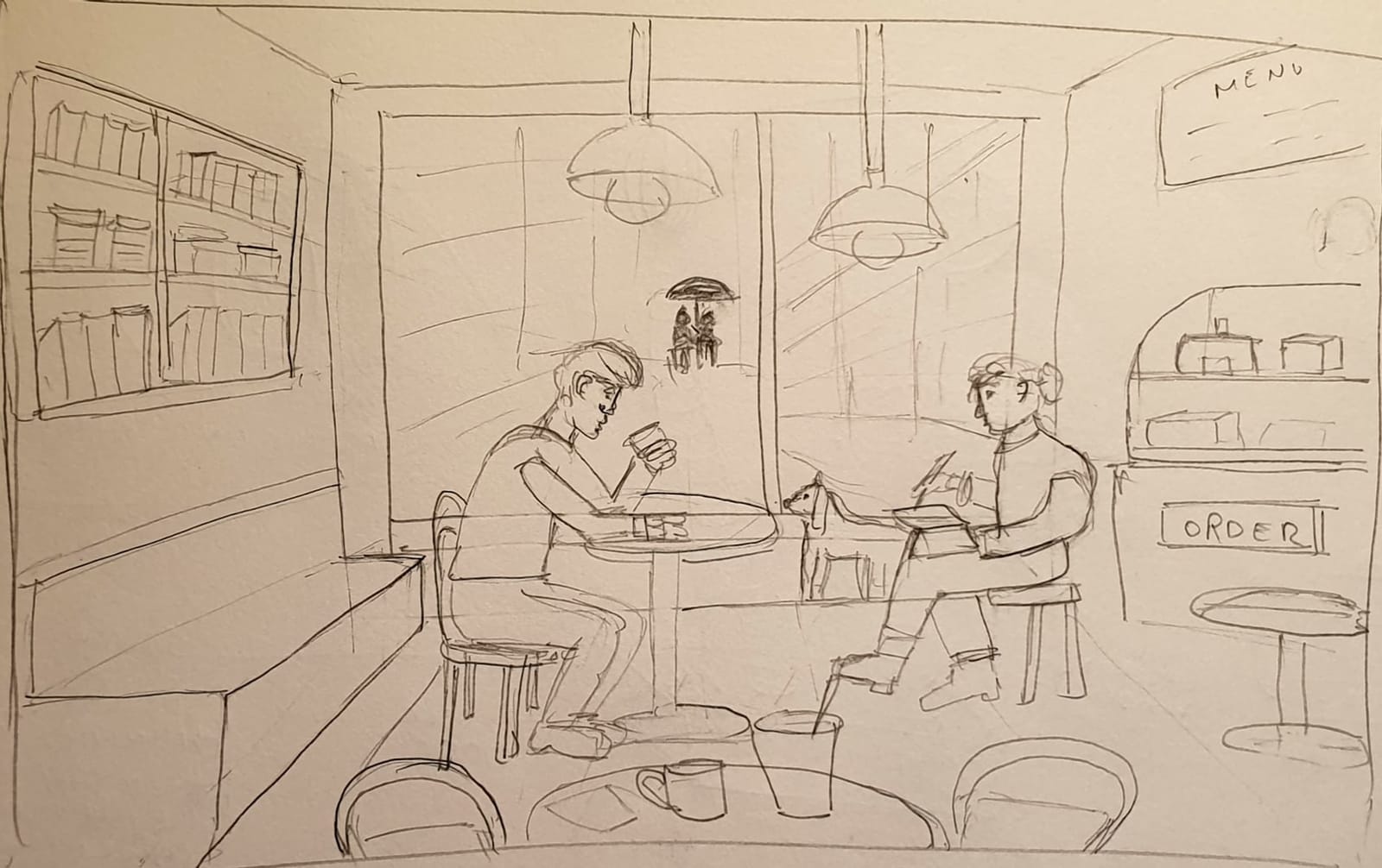
Aafreen Hayat
You used perspective. the rough composition is fine. most of the elements are in proportion. but your drawing looks very rough. its look like you were in hurry. most of the object dont have base. the floor/ground needs to be added. you need to work on the line quality, your lines are not confident and looks rough. you could have added more human figure to make your drawing dramatic. also, the outer detailing is missing. improvements : work on lie quality, composition, proportions, you need to add detailing
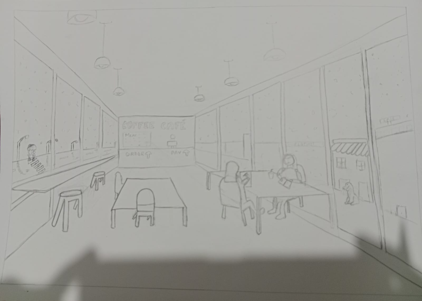
Nandini Bansal
Good to see you have utilised whole page for your composition. the floor tiles or groundwork is missing and everything seems in the air. the atmosphere somewhat looks like cafe. but one thing to notice is that most of the spaces look empty. you could have improved here by adding some of the cafe objects. for window and glass shield, you could have added thickness to windows, also some elements of window so resemble it. the sketch lines look weak, and you need to improve on your line quality. hatching/stocking is somewhat missing. you could have improved it by doing uniform hatching in one direction. overall, you need to add details to your sketch. even you can add more human figure to the sketch
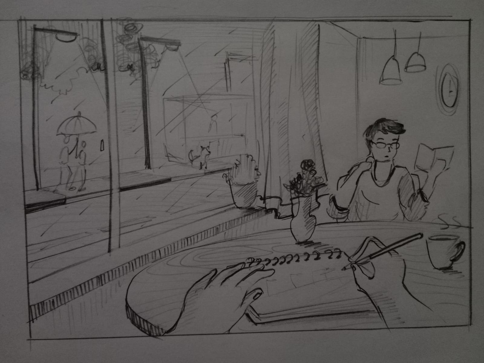
Somya Thakre
The line quality and perspective are fine, the detailing on the table looks fine. However, you need to improve on the line quality, the detailing of the wall is missing which makes background elements look rough. if you see the flowerpot on the table, it looks rough and not in symmetry. The Question asks to draw two friends whereas in your sketch this is completely missing which makes the sketch incomplete. still adding 14 for your sketch.
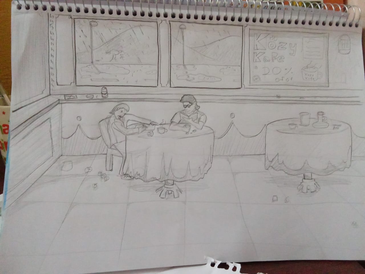
rakshan
Good to see you have utilised whole page for your composition. the floor tiles are acting as base to other objects, and everything seems to be on grounded. the atmosphere somewhat looks like cafe. but one thing to notice is that right left below part is somewhat look empty. you could have improved here by adding some of the cafe objects. the windows look like painting hanging on the wall, here you could have added thickness to windows, also some elements of window so resemble it. the perspective looks linear, and composition is also fine. to improve it... you could have added different perspective and drama to your composition by adding proportionate human and other objects, the sketch lines look weak, and you need to improve on your line quality. hatching/stocking is somewhat casual and not uniform in direction. you could have improved it by doing uniform hatching in one direction.
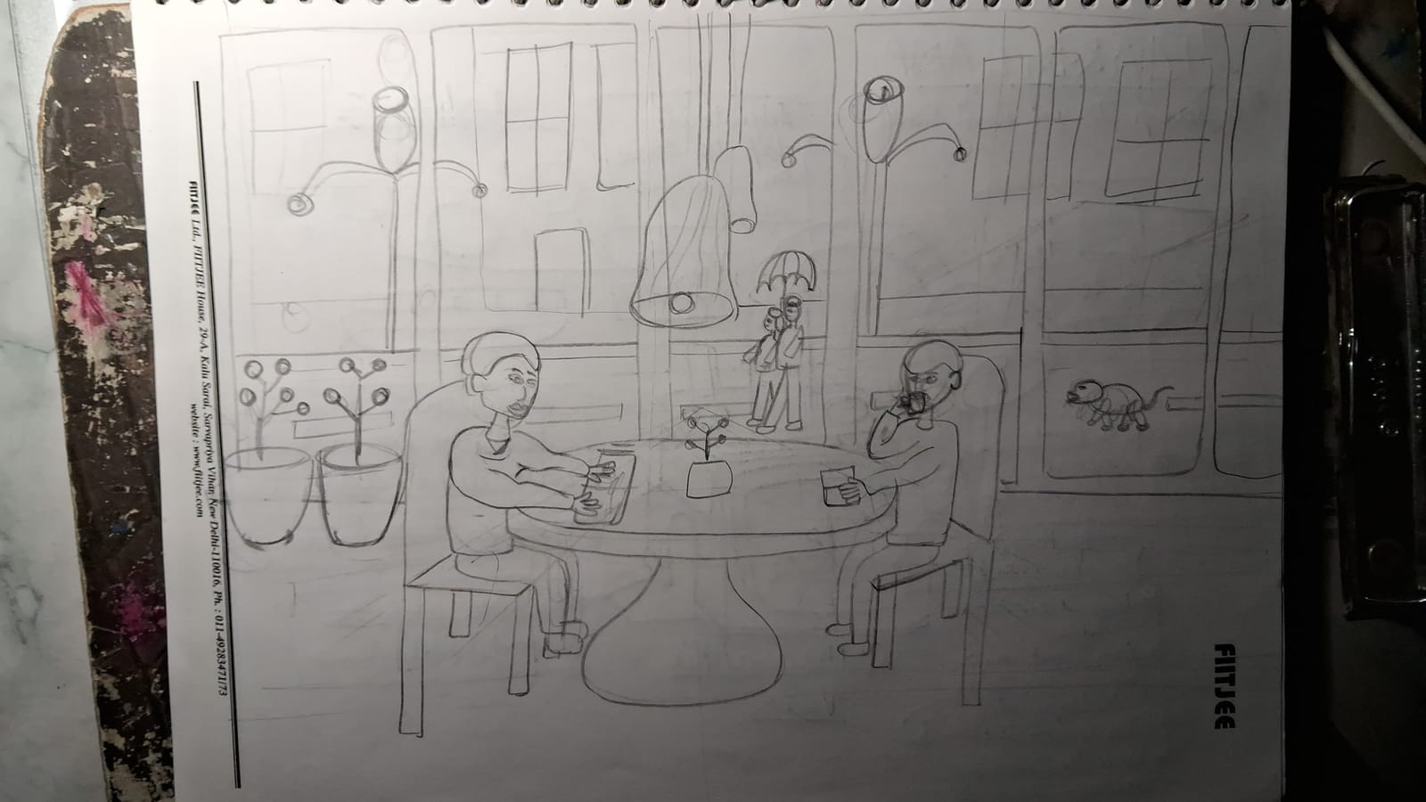
Tarang Mittal
Perspective wise it is in linear. But some of the elements are shown in the one point perspective. If you want to use 1 point or 2 point perspective then it should be appropriate. the drawing look rough and look like you was in hurry. We would suggest to utilise your time according to efforts. For example lets say you have 30 min to sketch this then you could use the first 5 mint ideate and finalise the sketch then next 7-8 min for drawing and 10-15 in for the finishing. the proportion of wire or hanging elements if the light needs to e uniform. The ouster lights seams like it is inclined inside the cafe. There is no floor or ground so some of the elements like human figures, plants looks in the air. And not grounded. the chair’s proportion and perspective is off from the grid and pot kept on the table looks very flat. Outer elements like other buildings and others are too rough. where you can improve- first improve your line quality. Then work on the perspective and proportions (you can draw light guide line to sketch. You need to practice curves and different different objects which will be used in your composition drawing question
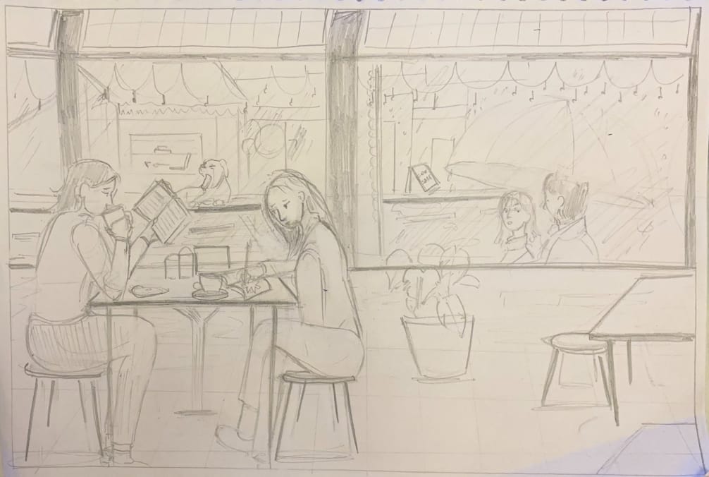
Manya Singhal
The scene composition looks fine. but you need to work in line quality. I mean the lines looks repeated and rough. you need to make it fair, the lines quality should be good. the plant pot is also incomplete. see your drawing has potential to improve it further, and you need to work on line quality, shadows, the detailing of exterior etc. overall good attempt
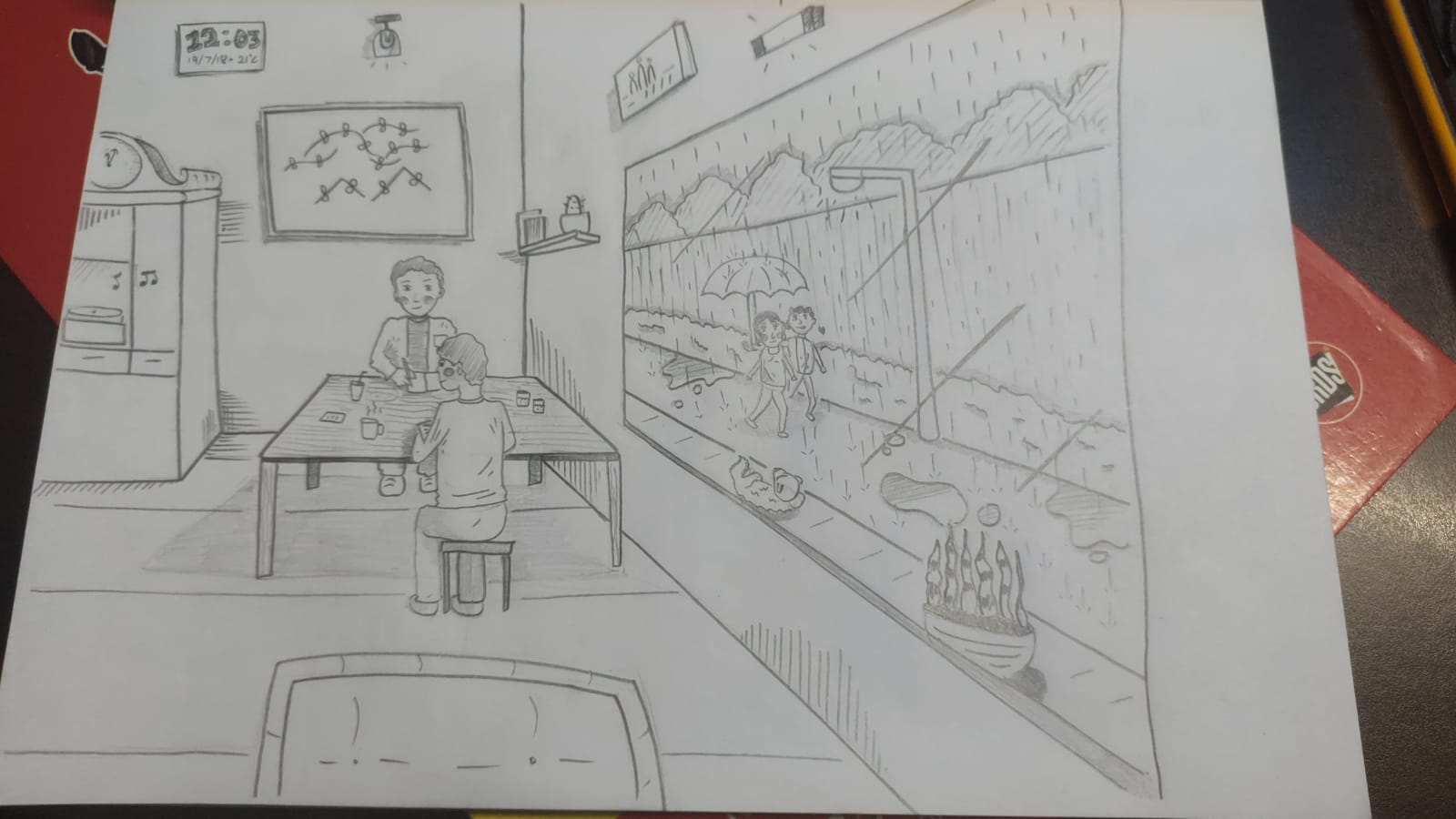
Mohit Kumar
We can see you have used proper perspective here everything looks proportionate here. you could have added more human figure to create cafe environment. the window needs to have thickness which will give weight to window. Also, the window wind shield refraction/reflection needs to refine, it is giving the false feeling of wall painting and not the window. you could have added more table and human to make it look like cafe. good attempt
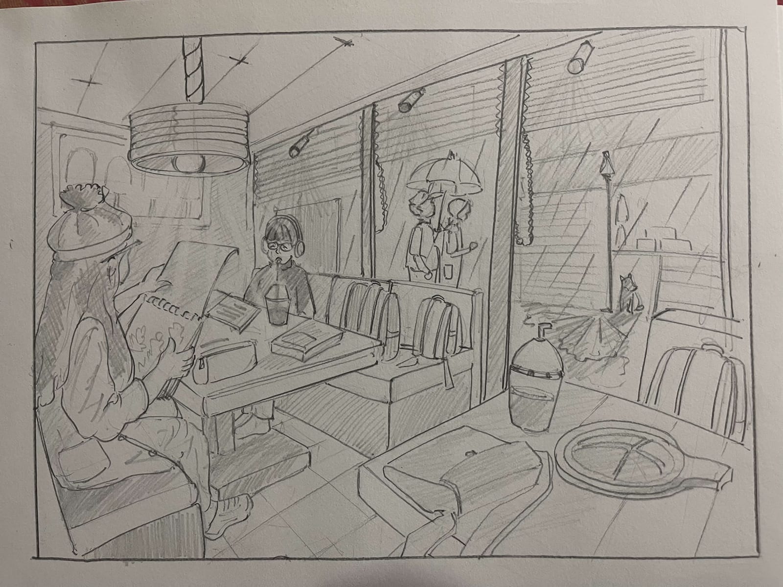
Tanvi
This is very unique and interesting perspective. you added adequate details to the composition. the lights, outer human figure etc look perfect, but you need to improve it on line quality. i mean if you add different different line weight to your line quality then it will help you to make your drawing better. the hatching/ shadow should be uniform and in uni-direction. perspective and proportions are in good pace at your level. keep sketching
4.7 (2 ratings)
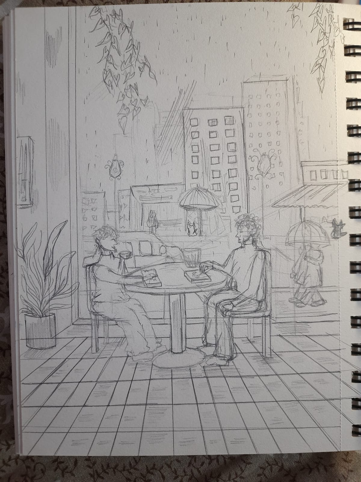
Janvi Sharma
Composition wise it is good I can see the horizon full of building landscape and natural elements like trees etc. you have added floor to your drawing which is good. the far elements like building can be rough or low priority line width and quality as you shown in drawing. but when it comes to the primary objects then the line quality and stroke should be fine in line quality. I can see multiple lines while drawing the human figure and it is your main object so please try to fine tune it. you forgot to add animal inside the cafe, as asked in the question scenario you need to add dog to your interior. composition wise this is nice at your level. its seems like objects are far in on the paper. try if you can make it bigger, and prominent. apart from this you can work on your strokes and weight of your lines. overall good presentation.
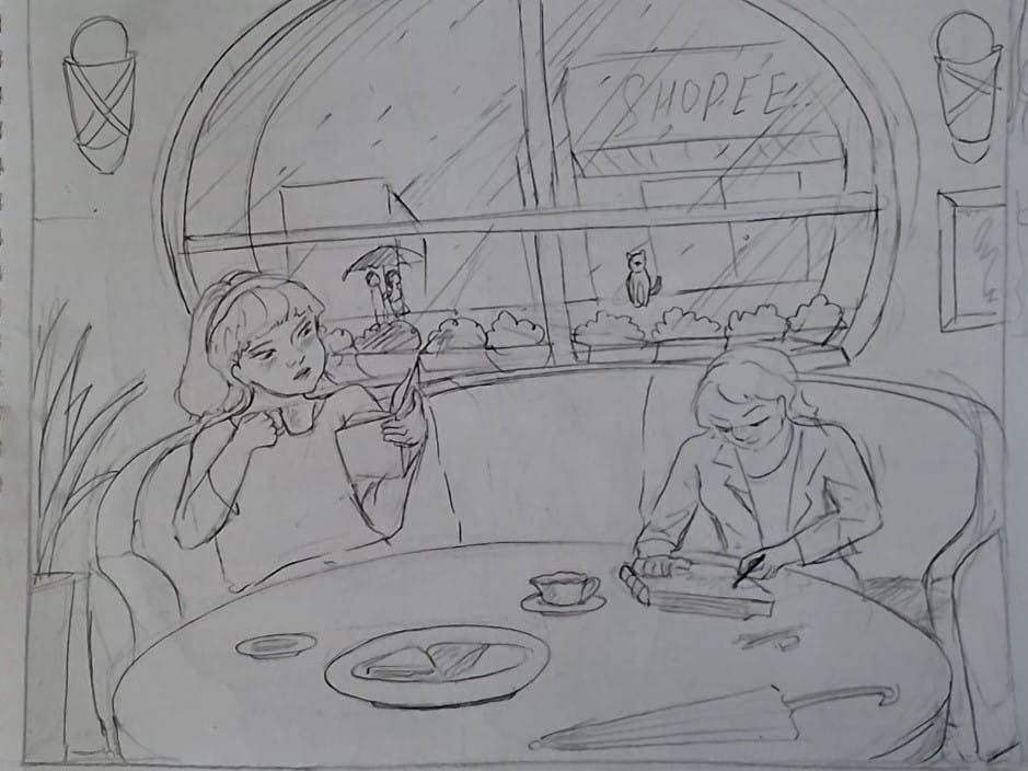
Arohi Tetarway
Aarohi! I really liked clean simple view angle which doesnt mess up understanding the scenario. But the line quality needs to be highly improved. I see broken lines everywhere. Also I see lot of proportional deformations here n there. You're a good sketcher and somewhere in the middle of the practise. I would suggest you to practise line, circles, forms sketching warmup every single day. (This is the only way you get mature strokes. Practise almost for 2 hours every morning) Otherwise all the points are covered in the scenario. your sketch is properly filled up. Does't look like its half done. But you can do better.
Pearl Goel
Good part is that the sketch looks finished, theres no white space. But the whole sketch looks little distorted. This is becaue of irregular floor to wall binding. Also the sketch looks too planned. Let it flow. Make it look lively with some natural strokes. You dont have to make lines too straight. Anatomy and facial expressions need little more improvement. But the overal sketch is fair. Try to lock the direction of light and add little shades in the sketch. This gives a good depth in a scene. Also try finishing up forms like floors, pot and other products around.
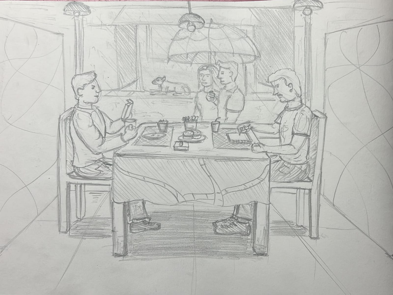
Aniruddha Rege
The sketch demonstrates a clear attempt at one-point perspective with good sense of depth and composition. many of the student will attempt 1 point perspective in exam and you need to be unique and confident while choosing sketch angle and perspective. Figures are proportionate, though postures appear somewhat stiff and lack natural fluidity. Narrative elements from the brief—coffee cups, book, sketchpad, umbrella couple, and dog—are well observed and integrated. Composition is balanced, and the café atmosphere is conveyed effectively. Shading is neat, but variation could be stronger to enhance mood and depth. Secondary details (wall patterns, floor tiles) are less refined compared to the central focus. Overall, a commendable attempt showing strong imagination and observation skills. Further improvement is needed in perspective accuracy, human posture, and contrast. also your pencil strokes can be more cofident, here i can see you have tried overlapping stroke while sketching. lines need to be fine tune, and it should be look confidents. overall good attempt but can be improve.
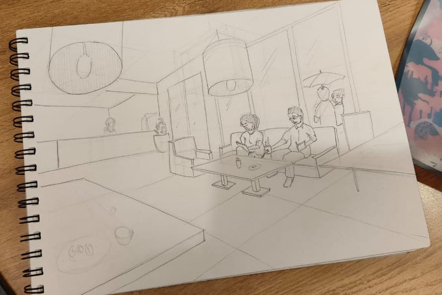
Siya Ghorpade
This is one of the interesting view, we can see the perspective are perfect at your level. all the human figures are on the action. but your drawing is heavy at right side and look incomplete - empty at left side of the paper. how to improve it: - add more human figure, since we can see your left side is full empty, you can add more human figure in action. it will add drama to your drawing. you can use different - different line weight to highlight the near and far objects. the details of the objects are missing. the counter looks empty, you can add more elements and objects + human figure to it.
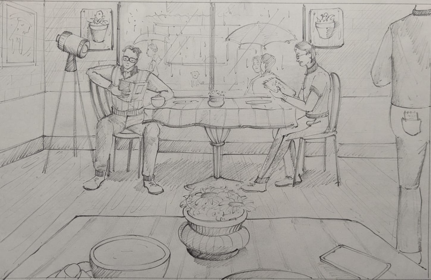
Riddhima Gupta
The composition looks interesting. you have added good elements in your composition for eg: the light lamp, the table, window behind etc looks perfect. your perspective looks linear but well and neat. the proportions and line quality also helping us to identify near and far objects. your line quality has confidence which is perfect at your level. you could improve on shadowing the drawing your shadow needs detailing, you can achieve this by using different line weights in some of the darker and near objects. the natural elements on the outer side of the window can add more drama to your drawing for ex: trees, sign boards, etc. good composition
4.8 (2 ratings)