The Messy Gen-Z Study Desk
A design student has been working through the night. Their desk is crowded with a laptop, sketchbook, headphones, coffee cup, stationery, charging cables, sticky notes, and a desk lamp. Task: Draw the scene from the viewpoint of a person sitting directly in front of the desk. Show the objects with correct scale, overlap, depth, and perspective. Challenge: Make the scene feel naturally messy without losing spatial clarity. Aesthetic direction: Contemporary student workspace — minimal furniture, expressive clutter, believable everyday objects.
Notes
- Use only a pencil. Do not use colours.
- Explain your design only through visuals and short labels.
- Do not write separate explanations.
- Focus on perspective, proportion, scale, depth, and spatial relationships.
Start timer
Evaluation criteria
- Perspective Accuracy — Correct horizon, convergence & spatial construction.
- Proportion & Scale — Consistent size relationships.
- Depth & Space — Clear foreground, middle ground & background.
- Foreshortening — Convincing angles and shortened forms.
- Composition — Strong framing and placement.
- Observation — Relevant environmental details.
- Visual Communication — Clear story through visuals and labels.
- Line Quality — Confident, controlled & readable lines.
Submit your sketch
Upload your work to appear in the gallery after review.
Community Work
Loading sketches…
Community Work
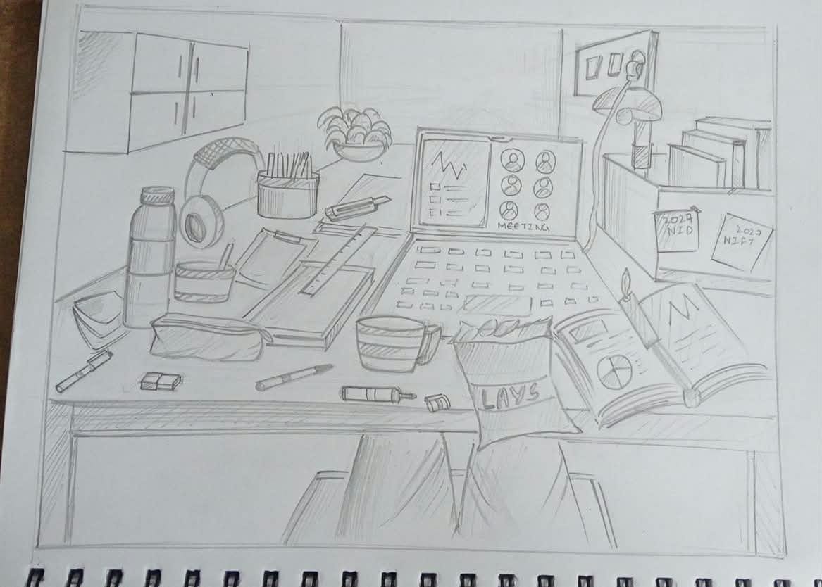
Anonymous
I like the interesting viewing angle and the choice of objects. It gives the composition a nice perspective and makes the desk setup feel engaging. However, the room itself needs better proportions and perspective consistency, especially the walls, shelves and background elements. The objects also need more accurate construction, so focus on basic forms, proportions and alignment before adding details. I would love to see you push the sketching style further by creating stronger visual highlights and contrast. Use varied line weights, darker shadows and at least two pencils (HB and 2B) to establish depth and bring attention to the important objects. Don't keep every element at the same tonal value. Let some objects stand out while others remain subtle. The idea and viewing angle are interesting; now make the execution equally engaging.
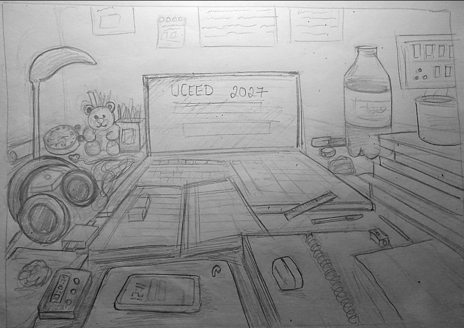
Parul
Well thats really messy.The main issue is that the individual objects are not constructed strongly enough, so the scene feels more messy than intentional. The contours are quite scratchy and repeated, creating a lot of visual noise. Try to draw with fewer, more confident strokes. Build each object with simple boxes, cylinders and ellipses first, then add details. The perspective needs more control too. Table edges and objects should follow a consistent perspective so the scene feels more believable. The shading is also quite even, so there isn’t enough foreground–mid ground to background separation. Push the darker values closer to the viewer and keep distant elements lighter. Some background objects are getting too much attention. Simplify them so the main products remain the focus. Overall: The composition is good, but the execution needs more control. Focus on clean construction, stronger perspective, confident lines and gradual detailing. Don’t try to make it detailed too early. Build it and then refine it.
4.0 (1 ratings)